The LogProduct
Reduce Cone Area by 4.9–11.5%: Cyclone Track Uncertainty for Planners
Make cyclone track uncertainty actionable with ensembles, probability ellipses, ML, and CRPS/PIT verification for landfall and routing.
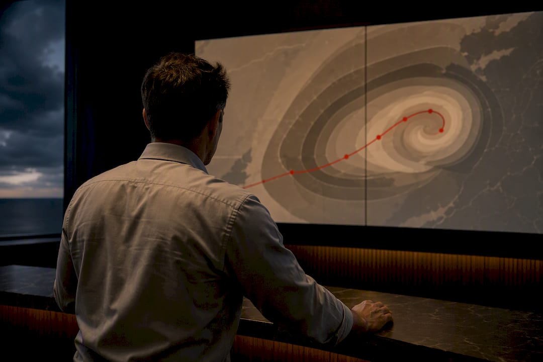
For operational decisions, treat cyclone track uncertainty as a forecast-specific probability distribution, not a static cone. The preferred tools are ensemble-based PDFs, probability ellipses, or ML-predicted bivariate distributions, each verified against CRPS, PIT histograms, and hit rates. Planners should act on landfall probabilities and hazard footprints, never on the center line alone.
TL;DR:
- Ensemble-based probability distributions, such as probability ellipses or ML-predicted bivariate models, more accurately represent cyclone track uncertainty than static cones.
- The NHC cone of uncertainty is built from historical errors, covering the true storm center about two-thirds of the time, meaning it intentionally underestimates some risks.
- Error growth in storm track predictions is anisotropic, with larger errors along the direction of movement and smaller errors perpendicular to it, which probability ellipses better capture.
- Combining ensemble forecast data with validated marine harbor and routing information significantly improves decision-making for coastal and maritime hazards.
- Machine learning approaches can generate storm-specific uncertainty estimates quickly and have shown comparable or better accuracy than traditional ensemble methods in peer-reviewed research.
Table of Contents
- What Does the NHC Cone Actually Represent?
- Why Do Track Errors Stretch Differently Along and Across the Path?
- How Do Ensemble Forecasts Turn Into Strike Probabilities?
- Can Machine Learning Predict Storm-Specific Uncertainty Better Than a Cone?
- Which Verification Metrics Actually Prove a Forecast Is Calibrated?
- How Should Uncertainty Be Displayed to Avoid Misreading?
- How Do You Turn Probabilities Into Evacuation and Routing Decisions?
- How Can Validated Marine Data Sharpen Probabilistic Routing Decisions?
- What Actually Drives Uncertainty in the Initial Conditions and Model Physics?
- How Does Data Assimilation Reduce Track Uncertainty?
- Do Model Resolution and Ensemble Size Change How Reliable Uncertainty Estimates Are?
- How Do You Combine Uncertainty Across Multiple Competing Models?
- How Should You Communicate Uncertainty to Different Audiences?
- What Do Recent Storms Show About These Methods in Practice?
- Where Should Research-To-Operations Priorities Go From Here?
- Get Validated Marine Data Alongside Your Probability Forecasts
- Where to Verify These Methods and Numbers Yourself
- Sources
- FAQ
What Does the NHC Cone Actually Represent?
The National Hurricane Center’s cone of uncertainty is built from geometry, not physics. Forecasters draw imaginary circles at each forecast lead time, sized so that each circle’s radius encloses a typical fraction of the official forecast errors recorded over the previous five years. String those circles together and smooth the envelope, and you get the familiar cone shape that dominates every hurricane graphic during the season.
The radii are fixed for the entire season once NHC updates them, typically each spring, based on the prior five years of verified track errors. That’s a critical operational detail: the cone reflects historical average skill, not the atmospheric setup of the storm currently on your screen. A storm embedded in a well-observed, high-confidence steering pattern gets the same cone width as one caught in a chaotic, weak-gradient environment.
Coverage-wise, the NHC’s own documentation states that the 5-day center-track position falls inside the cone about two-thirds of the time. That means the cone is engineered to fail roughly one-third of the time by design, not by error. Practitioners who don’t internalize that number tend to over-trust the graphic when a storm’s actual path drifts outside the shaded area.
Three misinterpretations show up again and again in after-action reviews and public feedback:
- The cone shows uncertainty in the storm’s center position only. It says nothing about how far wind, storm surge, or rain hazards extend beyond the shaded envelope.
- Many viewers fixate on the centerline drawn through the middle of the cone as if it were a most-likely path, when it’s simply the deterministic forecast track with no probability weighting attached.
- The cone’s static, seasonal construction means it cannot widen or narrow based on a specific storm’s actual model spread, even when that storm shows unusually high or low ensemble agreement.
The NHC itself is explicit that wind and surge hazard fields are provided separately from the track cone, precisely because hazards routinely extend well outside the cone’s edges. For a disaster planner briefing a coastal county, or a captain deciding whether to hold a mooring, the operational rule is straightforward: never present the cone alone. Layer it with wind-threshold probability maps and rainfall guidance, and attach a specific numeric probability whenever you brief a decision maker. “Inside the cone” is not a safety statement. It’s a historical coverage statistic wearing a graphic’s clothing.
Why Do Track Errors Stretch Differently Along and Across the Path?
Track error is not a uniform blob around the forecast point. It stretches along the direction of motion and compresses across it, a property researchers call anisotropy, and it’s the single biggest reason a circular cone wastes information.
Along-track (AT) error measures how far off a storm ends up ahead of or behind its forecast position along the direction of travel. Cross-track (CT) error measures the perpendicular displacement, left or right of the forecast heading. Translation speed drives most of the imbalance: a fast-moving storm racing across open water tends to accumulate larger AT error because small timing mismatches compound into large positional misses, while a storm holding a steady heading keeps CT error relatively tight. Recurvature reverses that pattern. As a storm curves poleward and interacts with mid-latitude troughs, NHC’s experimental research on cone anisotropy shows CT error spikes sharply because small errors in the timing of the turn translate into large lateral displacement.
A circle forces equal uncertainty in every direction, which means it systematically overstates uncertainty along the tight axis and understates it along the loose one. A probability ellipse fixes that by fitting the actual shape of the error distribution instead of forcing a compromise.
Ellipse construction typically starts from an ensemble or historical error sample at each lead time, computes the covariance between AT and CT displacement, and draws the ellipse whose axes align with the dominant error directions and whose size matches a target coverage level, commonly 70%. The payoff shows up directly in area efficiency. A 2023 study in the Journal of Geophysical Research found that 70% probability ellipses covered the same nominal fraction of outcomes as circles while occupying 4.9% to 11.5% less area for lead times between 48 and 120 hours, precisely because they stopped wasting space on directions where the storm rarely goes.
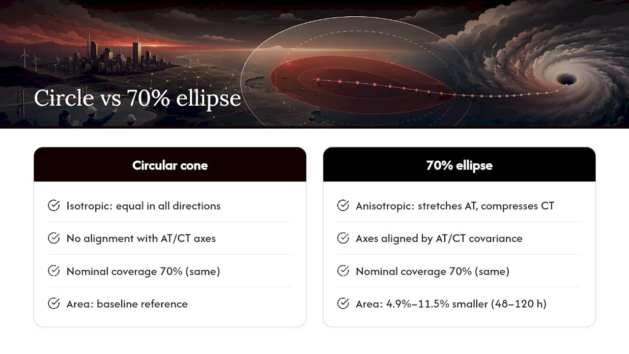
For operations, the ellipse’s orientation carries information a circle simply cannot express: it points toward the coastline segment most likely to see landfall and tells a planner or a maritime routing desk where to concentrate scrutiny, rather than spreading attention evenly across a shape that overstates risk on the storm’s flanks.
How Do Ensemble Forecasts Turn Into Strike Probabilities?
Ensembles convert model uncertainty into a usable probability by treating each member’s track as one plausible draw from the true forecast distribution, then counting how often those draws pass near a given location. Run enough members, an operational grand ensemble mixing GEFS and ECMWF output can push into the dozens, and the spread of endpoints at any given lead time becomes an empirical stand-in for the full forecast PDF.
The conversion from raw member tracks to a usable strike probability follows a fairly standard pipeline:
- Extract each ensemble member’s position at each forecast hour and treat the full set as a scatter of plausible center locations.
- Apply kernel density estimation to smooth that scatter into a continuous probability surface rather than a jagged point cloud.
- For a specific coastline segment or port, count the fraction of members passing within a defined radius, a method known as count-based hit probability, and report that fraction directly as a strike percentage.
- Weight members by historical skill or recent bias-correction factors before counting, since raw ensemble members are rarely equally reliable.
Bias correction matters more than most newcomers to the field expect. Individual ensemble systems carry systematic tendencies, some models consistently pull storms too far poleward, others lag recurvature timing, and correcting for that drift before pooling members prevents a persistent model quirk from masquerading as genuine forecast uncertainty. Member weighting follows a similar logic: a model with a stronger recent verification record for the current basin and season should carry more influence in the pooled probability than one with a weaker track record, though weighting schemes need periodic recalibration since skill rankings shift between models year to year.
Low member counts create a separate problem. A 20-member ensemble sampling a genuinely wide distribution will still produce lumpy, unstable density estimates purely from sampling noise, which is why many operational centers apply ensemble thinning or smoothing kernels before generating a strike-probability map, and why a single model’s ensemble, however large, still benefits from blending into a multi-model grand ensemble for a more robust tail estimate.
Pro Tip: When comparing ensemble-derived strike probabilities across models, always check the raw member count before trusting a sharp probability gradient near the edge of a hazard zone. A 15-member ensemble and a 50-member ensemble can report the same 40% strike probability with very different confidence in that number.
The core limitation to flag for any stakeholder briefing is model dependence. An ensemble’s spread only reflects the uncertainty that its parent model’s physics and resolution can actually represent. A system that’s chronically under-dispersive will hand decision makers a false sense of precision, while an over-dispersive one will wash out genuinely useful signal under noise. Neither failure mode is visible from the probability map alone, which is exactly why cross-model verification, not just ensemble spread, belongs in every operational uncertainty pipeline.
Can Machine Learning Predict Storm-Specific Uncertainty Better Than a Cone?
Machine learning models can now generate a full uncertainty distribution tailored to the storm sitting in front of you, rather than borrowing a shape from five years of unrelated storms. That’s the core shift these methods represent, and it’s why they’ve drawn serious attention from research-to-operations teams over the past several years.
Two architectures dominate the recent literature. Probabilistic neural networks are trained to output the parameters of a distribution, often a bivariate normal, directly from forecast-specific inputs: ensemble spread, storm intensity, translation speed, basin, and steering-flow characteristics. Instead of predicting a single track and bolting a generic error bar onto it, the network learns to predict how wide and how oriented the error distribution should be for a storm with these specific characteristics. Recurrent architectures, particularly LSTM networks, take a different but complementary approach: they exploit the sequential, time-dependent nature of track evolution to capture spatiotemporal correlations in error growth that a point-in-time model can miss entirely.
What the evidence shows: A probabilistic neural network approach reported in a recent arXiv study achieved CRPS scores better than the static NHC cone and performance comparable to the GEFS ensemble system, while requiring negligible computation once the model finished training.
That last point matters operationally. Ensemble systems demand running dozens of full dynamical model integrations, an enormous computational cost repeated every forecast cycle. A trained neural network, by contrast, produces its uncertainty estimate in a fraction of a second once the training phase is complete, which opens the door to running these models far more frequently or on far more storms than a full grand ensemble could support.
The LSTM line of research tells a similar story from a different angle. A 2026 study on situation-dependent uncertainty found that an LSTM-calibrated cone of uncertainty outperformed an official deterministic forecast agency’s product in many tested situations, with accuracy improving further when global model guidance was folded into the input features. The practical implication for a research-to-operations pipeline is that these models don’t need to replace existing forecast infrastructure. They need to consume its outputs as additional predictors.
Implementation is where most of the real work sits, and it deserves specific attention before any operational center commits to one of these approaches:
- Training data window and basin coverage. Models trained on a single basin’s climatology (Atlantic-only, say) often need domain adaptation before deploying on Western Pacific or Southern Hemisphere storms, where steering patterns and recurvature behavior differ meaningfully.
- Input feature selection. The strongest published models lean on ensemble spread statistics, storm-specific attributes (intensity, size, translation speed), and steering-flow diagnostics, rather than track position alone.
- Retraining cadence. Because model skill and bias characteristics shift as operational NWP systems are upgraded, the ML layer needs periodic retraining against fresh verification data rather than a one-time training run.
- Interpretability for forecasters. A bivariate normal output is easy for a working forecaster to sanity-check against an ensemble spread map. A black-box nonparametric PDF is harder to trust in real time without a verification track record behind it.
None of this displaces human forecaster judgment. What it does is give that judgment a sharper, storm-specific starting point instead of a one-size-fits-all seasonal average.
Which Verification Metrics Actually Prove a Forecast Is Calibrated?
The Continuous Ranked Probability Score, or CRPS, is the standard metric for scoring a full probabilistic forecast against a single observed outcome, and it’s the one that shows up most often in the peer-reviewed literature comparing ML methods, ensembles, and the static cone. CRPS rewards both sharpness (a tight, confident distribution) and calibration (a distribution that actually contains the truth at the rate it claims to), which makes it far more informative than a simple hit-or-miss score.
PIT histograms, short for Probability Integral Transform, test calibration from a different angle: they check whether the observed outcomes fall uniformly across the predicted distribution’s percentiles over many forecasts. A flat PIT histogram means the model’s stated confidence matches reality. A histogram skewed toward the edges means the model is overconfident, claiming tighter uncertainty than its actual error record supports, while a histogram peaked in the middle means the model is underconfident.
A practical verification protocol for any operational uncertainty product should run through these steps:
- Stratify verification by lead time and by basin separately, since error growth rates and model skill both vary sharply across both dimensions.
- Use rolling cross-validation rather than a single fixed train/test split, so the model’s performance reflects genuine out-of-sample skill across multiple seasons.
- Score landfall probability specifically, not just open-ocean track error, since that’s the number stakeholders actually act on.
- Evaluate the sharpness-reliability trade-off directly: a model can always achieve perfect reliability by predicting an enormous uncertainty envelope, so sharpness has to be checked alongside calibration, never in isolation.
- Run cost-loss simulations that translate false alarms and missed events into decision-relevant terms, since a false alarm that triggers an unnecessary evacuation and a miss that leaves a coastal segment unwarned carry very different real-world costs.
That last step deserves emphasis for disaster planners specifically. A model with excellent CRPS scores can still produce a poor evacuation threshold if the cost-loss ratio for your jurisdiction, balancing evacuation costs against the cost of an unwarned landfall, isn’t built into the verification design. Verification on paper and verification for a decision are related but not identical problems.
How Should Uncertainty Be Displayed to Avoid Misreading?
Display choice changes what a viewer believes about a storm’s risk, independent of the underlying forecast quality. That’s not a minor design detail. It’s a documented human-factors problem with real operational consequences.
The static cone remains the default public product because it’s simple to render and familiar to viewers, but a 2012 study in the International Journal for Uncertainty Quantification found that ensemble-path composite displays, drawn as a swarm of individual Monte Carlo tracks, improved viewers’ ability to correctly estimate strike probability compared with the standard cone graphic. Fading each path’s opacity based on density, so that regions where many ensemble members converge appear darker than regions only a few members ever reach, adds an intuitive visual cue that correlates naturally with actual probability, letting viewers estimate likelihood without reading a legend.
Heat maps built from kernel-density strike probability offer a middle ground: they carry more nuance than a binary in-cone/out-of-cone read but require careful color-scale design, since a poorly chosen palette can make a 10% probability zone look nearly as alarming as a 60% zone.
Three human-factor pitfalls show up consistently in post-storm reviews and the Scientific American explainer on cone interpretation:
- Anchoring on the centerline. Viewers treat the deterministic track drawn through the cone’s middle as the forecast, even though it carries no more inherent likelihood than any other point inside the shaded envelope.
- Crisp edges implying false precision. A sharp cone boundary reads as a hard safe/unsafe line, when the true probability gradient fades gradually rather than stopping at an edge.
- Missing numeric anchors. A graphic without an explicit stated probability invites viewers to substitute their own intuitive estimate, which research consistently shows skews toward overconfidence in either direction.
Pro Tip: In a maritime briefing, never hand a captain a cone graphic alone. Pair it with an explicit strike percentage for the specific harbor or route segment in question, plus a stated time window, since “60% chance of tropical storm winds within 48 hours of arrival at this port” gives a decision maker something concrete to weigh against a schedule.
For coastal and marine briefings specifically, the strongest practice combines a probability-weighted display with plain numeric callouts tied to named locations and named time windows, rather than relying on the shape of a graphic to carry the full weight of the message.
How Do You Turn Probabilities Into Evacuation and Routing Decisions?
Converting a probabilistic track product into an actual decision means translating spatial probability into a specific coastal segment’s risk, then adding a time dimension and a size correction, since none of that arrives automatically from a raw ensemble output.
- Compute segment-specific landfall probability. Divide the coastline into discrete segments, then count the fraction of ensemble members or the integrated probability density passing within a defined threshold distance of each segment, rather than reporting one number for the whole storm.
- Fold in storm size. A compact storm and a broad wind field produce very different hazard footprints even with identical center-track probability, so segment risk should be adjusted using the storm’s radius of maximum wind and outer wind radii, not center position alone.
- Define an arrival-time uncertainty window, not a single expected arrival hour. Given that timing errors compound with distance, disaster planners should build in a conservative buffer, commonly extending evacuation and port-closure lead times earlier than the deterministic arrival estimate to absorb realistic timing error.
- Set explicit routing decision thresholds for maritime operators. A common operational framework ties action to probability bands: below roughly 10% strike probability for a route segment, continue passage with monitoring; between 10% and 40%, prepare alternate routing and shelter options; above 40%, shelter or divert rather than continue.
- Validate the shelter option against real harbor data, not just distance from the storm. A nominally safe anchorage with poor holding ground, exposed approaches, or no room for the vessels already sheltering there is not actually a safe option, regardless of how far it sits from the projected track. Local wind climatology, covered in detail in resources like this Adriatic wind guide for sailors, also matters when a storm’s outer circulation interacts with regional wind funneling effects around headlands and straits.
The common thread across all five steps: probability without a decision threshold is just a number on a screen. The operational value comes from pairing that number with pre-agreed action bands, so nobody is deciding evacuation timing or shelter choice for the first time in the middle of a landfall window.
How Can Validated Marine Data Sharpen Probabilistic Routing Decisions?
Probabilistic track products tell a mariner where risk concentrates. They don’t tell you whether the harbor sitting inside the lower-risk band actually has room, holding ground, or safe approach in a blow. That’s the gap between a forecast product and an actual routing decision, and it’s where validated marine data earns its place alongside the probability layer, not in place of it.
Some maritime assistants provide real-time sea-aware routing, live marine forecasts, and curated harbor information pulled from verified marine sources, layered on top of probabilistic track guidance a sailor is watching. A workable operational sequence looks like this: pull the ensemble-derived strike-probability or landfall heat map for the relevant coastline, then overlay harbor and shelter suitability data for the segments carrying meaningful risk, and finally rank the resulting shelter or reroute options by combined exposure and arrival-time-window risk rather than by distance alone.

That sequencing matters because the two data layers answer different questions. The probabilistic forecast quantifies where and when hazard is likely. Validated harbor data determines whether a given shelter option can actually absorb that risk safely. Neither one substitutes for the other, and treating a probability map as a complete routing answer, without checking the ground truth of the destination, is how mariners end up sheltering somewhere that looks safe on a heat map and turns out to be untenable in practice.
What Actually Drives Uncertainty in the Initial Conditions and Model Physics?
Every track forecast starts from an estimate of the storm’s current position, intensity, and surrounding steering flow, and that estimate is never perfectly known. Observation gaps over open ocean, sparse in-situ measurements compared to land-based networks, and the storm’s own convective structure obscuring its exact center all introduce initial-condition error before a model even begins its first forecast step.
Model physics adds a second, distinct layer of uncertainty. Parameterizations for convection, boundary-layer mixing, and air-sea heat exchange all involve simplifying assumptions, and different operational models make different choices, which is part of why GEFS and ECMWF ensemble members diverge even when initialized from similar analyses. Steering-flow representation is particularly sensitive: small errors in how a model resolves the mid-latitude trough that will eventually capture a recurving storm can cascade into large downstream track divergence, precisely the recurvature-driven cross-track error growth described earlier in the discussion of anisotropy.
Characterizing these two sources separately matters for research priorities. Initial-condition uncertainty can be reduced through better observation networks and improved data assimilation, discussed next, while model physics uncertainty is fundamentally a resolution and parameterization problem that improves more slowly, through model development cycles rather than observation upgrades. Ensemble systems try to sample both sources simultaneously by perturbing initial conditions across members and, in some systems, by also varying physics parameterizations between members, which is part of why a well-designed ensemble captures more of the true uncertainty than a single deterministic run ever could.
How Does Data Assimilation Reduce Track Uncertainty?
Data assimilation is the process of blending observations, aircraft reconnaissance, satellite imagery, buoy and ship reports, into a model’s initial state in a way that’s statistically consistent with both the observations’ known error characteristics and the model’s own background uncertainty. Better assimilation means a more accurate starting point, and since track error grows outward from that starting point, tightening the initial condition directly tightens the resulting forecast spread.
Aircraft reconnaissance data deserves particular attention here, since dropsonde and tail-Doppler radar observations gathered during hurricane hunter missions have historically produced some of the largest measurable improvements in track forecast skill, precisely because they sample the storm’s inner-core structure and immediate environment directly, rather than relying on remote-sensing inference. Storms sampled by reconnaissance flights consistently show tighter initial-condition uncertainty than storms observed only by satellite, which is one reason ensemble spread narrows noticeably once aircraft data starts flowing into a storm’s forecast cycle.
Modern assimilation schemes, ensemble Kalman filters and four-dimensional variational methods among them, also help quantify the initial-condition uncertainty itself, not just correct the initial state. That quantification feeds directly into ensemble generation: initial condition perturbations for ensemble members are typically drawn from the same statistical framework the assimilation scheme uses to estimate its own analysis uncertainty. In this sense, data assimilation and ensemble uncertainty estimation aren’t two separate problems. They share the same underlying error-statistics engine, and improvements in one tend to propagate into the other.
Do Model Resolution and Ensemble Size Change How Reliable Uncertainty Estimates Are?
Resolution and ensemble size both shape uncertainty estimates, but through different mechanisms, and conflating them is a common mistake in evaluating forecast systems. Resolution determines whether a model can physically represent the storm’s inner-core structure and its immediate steering environment at all. A model grid too coarse to resolve a storm’s true intensity and structure will systematically misrepresent the steering-flow interactions that drive track evolution, producing biased rather than merely noisy forecasts.
Ensemble size, separately, determines how well the ensemble’s spread approximates the true forecast probability distribution rather than a noisy sample of it. A small ensemble, a dozen members or fewer, can produce highly variable spread estimates from one forecast cycle to the next purely from sampling limitations, even if every individual member is well-resolved and physically sound. That’s the sampling-noise problem discussed earlier in the ensemble section, and it’s precisely why operational centers increasingly blend multiple model ensembles into larger grand ensembles rather than relying on any single model’s member count alone.
The two factors interact in a way that matters for resource allocation decisions. A center with limited computational budget faces a genuine trade-off: run fewer members at higher resolution to better resolve storm structure, or run more members at coarser resolution to better sample forecast uncertainty. Neither choice dominates the other in every situation. Rapidly intensifying storms with complex inner-core structure tend to benefit more from resolution, while storms in genuinely uncertain steering environments, near recurvature or interacting with another system, tend to benefit more from larger ensemble sampling. Understanding which regime a given storm sits in is itself a forecasting judgment call, one that ML-based, forecast-specific uncertainty methods are increasingly well suited to help inform.
How Do You Combine Uncertainty Across Multiple Competing Models?
No single model, however well-tuned, captures the full range of plausible track outcomes on its own, which is why multi-model grand ensembles, pooling GEFS, ECMWF, and other operational systems together, have become the standard approach for robust uncertainty quantification rather than a nice-to-have addition.
The core technical challenge is that different models carry different systematic biases and different levels of internal spread, so naively pooling their members together risks either double-counting a bias shared across models or averaging away genuine signal from a model with tighter, better-calibrated spread. Bayesian model averaging addresses this by weighting each model’s contribution according to its historical predictive skill, updated as new verification data arrives, rather than treating every model’s output as equally trustworthy by default.
Superensemble and stacking approaches take a related but distinct route: instead of just weighting each model’s raw output, they train a secondary statistical or machine learning layer to learn how to best combine the individual models’ predictions, effectively letting the data determine which model to trust under which conditions rather than fixing that trust in advance. This is conceptually close to the probabilistic neural network approach discussed earlier, except the inputs are model outputs rather than storm-specific raw features, and the two approaches are increasingly being combined in current research, feeding multi-model ensemble output into an ML layer that then predicts the final storm-specific distribution.
The practical payoff of doing this well is a distribution that’s neither falsely narrow, from ignoring genuine inter-model disagreement, nor uselessly wide, from double-counting shared biases as if they were independent sources of spread. Getting that balance right is precisely what CRPS and PIT verification, covered earlier, are designed to check.
How Should You Communicate Uncertainty to Different Audiences?
Emergency managers, the public, and maritime operators need the same underlying probability translated into three different vocabularies, because each audience makes a different kind of decision with different stakes and different time pressure.
Emergency managers generally need explicit numeric thresholds tied to their jurisdiction’s specific action triggers, an evacuation order threshold expressed as a stated strike probability for their county’s coastline segment, paired with the arrival-time window discussed earlier, so the decision to activate can be made against a pre-agreed standard rather than a real-time judgment call under pressure.
The public generally responds better to plain-language framing paired with a simple, concrete action, “there’s a 6 in 10 chance tropical storm conditions reach your area by Thursday evening, prepare your evacuation kit now”, than to a raw probability density map or an unlabeled cone graphic. The visualization research on ensemble-path displays and opacity-accumulation heat maps, discussed earlier, exists precisely because public audiences read graphics more intuitively than they read statistics, and a well-designed graphic can carry probability information a text warning alone often fails to convey.
Maritime operators sit somewhere between the two, needing both the numeric precision an emergency manager relies on and the operational specificity a general public warning doesn’t require: named ports, named route segments, explicit time windows, and a stated action threshold, continue, prepare to divert, or shelter now, tied directly to the probability number rather than left to individual interpretation. The routing-threshold framework covered earlier in the maritime operations section is essentially a communication strategy as much as it is a decision procedure, since its entire value lies in giving every operator the same probability-to-action mapping in advance.
What Do Recent Storms Show About These Methods in Practice?
The clearest recent demonstrations of forecast-specific uncertainty methods come from direct comparisons against the static cone and against operational ensemble baselines, rather than from any single dramatic storm.
The probabilistic neural network study referenced earlier tested its bivariate distribution approach across a substantial historical Atlantic basin dataset and found CRPS scores that beat the static NHC cone while matching GEFS ensemble performance, demonstrating that a trained model can substitute for at least part of a full ensemble run’s uncertainty information at a fraction of the computational cost. That’s a meaningful case study for any center weighing whether to invest in ML infrastructure versus simply running more ensemble members.
The LSTM-based situation-dependent uncertainty study offers a complementary case from a different basin’s operational context, showing its recurrent-network cone outperforming an official deterministic forecast agency’s product in a majority of tested situations, particularly once global model guidance was included as an input feature. The improvement wasn’t uniform across every storm type in the study, which itself is an instructive finding: situation-dependent methods earn their name precisely because their advantage over a static cone varies by steering regime, storm speed, and basin, not because they uniformly beat every deterministic baseline in every case.
Together, these case studies point toward the same operational lesson: forecast-specific probabilistic methods don’t need to universally dominate every existing tool to be worth adopting. They need to reliably outperform a static, one-size-fits-all cone on the metrics that matter, CRPS, calibration, and landfall probability skill, which the current published evidence supports across multiple independent research groups and multiple ocean basins.
Where Should Research-To-Operations Priorities Go From Here?
The gap between what’s published and what’s running operationally is still wider than it should be. Several peer-reviewed studies now show forecast-specific probabilistic methods beating the static cone on CRPS, yet most public-facing products still lean on a season-fixed circle. Operational centers should be running side-by-side trials of ensemble-derived PDFs, probability ellipses, and ML-predicted distributions against the existing cone, with routine CRPS and PIT verification built into every trial from day one, not bolted on after the fact.
Visualization research deserves more attention than it currently gets. The evidence that ensemble-path displays and opacity accumulation improve comprehension is over a decade old, yet it hasn’t meaningfully changed the default public graphic. That’s a communication research gap, not a modeling one, and it needs its own dedicated funding line rather than riding along as an afterthought to forecast-model development.
The most underexplored opportunity sits at the intersection of forecasters, modelers, and the people actually making decisions from these products, port authorities, maritime operators, county emergency managers. Pilot projects that put a working probabilistic ellipse or ML-cone product directly into a maritime routing desk’s hands, then measure whether decisions actually improve, would tell us more than another retrospective skill study ever could.
— Andrea
Get Validated Marine Data Alongside Your Probability Forecasts
Reading a strike-probability heat map tells you where the risk sits. It doesn’t tell you whether the harbor inside that lower-risk band has room, holding ground, or a safe approach in a blow, and that’s exactly the gap Nausika is built to close. It connects directly into the AI assistant you’re already using, pulling live marine forecasts, sea-aware routing, and curated harbor information from verified marine sources rather than generated guesses.

For a sailor or operator layering probabilistic track guidance onto an actual routing decision, that validated harbor context is the missing half of the picture. This service may require no new app and minimal setup, integrating into the assistant already in your workflow. Read a real example of that layered approach in the log post on the line that crosses the peninsula, or go straight to the Nausika landing page to start using validated maritime data the next time a probabilistic track product puts your route inside a risk band worth checking.
Where to Verify These Methods and Numbers Yourself
Start with the primary operational source: NHC’s cone construction documentation and its plain-language cone explainer for the coverage statistics cited throughout this piece. For live tracking during an active season, NESDIS maintains a public hurricane tracker drawing on the same operational feeds forecasters use.
For the underlying research, the probability ellipse study, the probabilistic neural network paper, the LSTM situation-dependent uncertainty study, and the visualization comparison paper cover every method discussed above in full technical detail.
FAQ
Is the Fujiwhara Effect Real?
Yes. The Fujiwhara effect describes two nearby tropical cyclones rotating around a common center and influencing each other’s track, and it’s a documented, physically real interaction rather than a theoretical curiosity, though it’s relatively rare and adds substantial track uncertainty whenever it occurs.
Do Cyclones Move Clockwise or Counterclockwise?
Tropical cyclones rotate counterclockwise in the Northern Hemisphere and clockwise in the Southern Hemisphere, a direct consequence of the Coriolis effect. That rotation direction is separate from the storm’s overall track or translation direction, which depends on the surrounding steering flow.
What Is the Cone of Uncertainty in a Hurricane Forecast?
The cone of uncertainty is a graphic built from the previous five years of NHC official track forecast errors, sized so the storm’s center falls inside it roughly 60% to 70% of the time over a 5-day forecast. It shows center-track uncertainty only, not wind, surge, or rainfall hazard extent.
How Accurate Are NOAA and NHC Predictions?
NHC track forecasts have improved substantially over recent decades, though accuracy still varies by lead time, basin, and steering-flow complexity. Forecast-specific methods, ensembles, probability ellipses, and ML-based distributions, now demonstrate measurably better calibration than the static seasonal cone in published peer-reviewed comparisons.
How Do Probability Ellipses Differ From the Standard Cone?
A probability ellipse fits the actual directional shape of track error, capturing the fact that along-track and cross-track uncertainty grow at different rates, while the cone forces a uniform circular shape in every direction. Ellipses can achieve the same coverage with 4.9% to 11.5% less area at longer lead times.